N1-3L compared to Apollo
A huge poster that's free to download
Introduction
As you may have noticed, I’ve been straying from photoreal CGI recently, and I was looking for an opportunity to do something like the cool infographic posters I had when I was a kid. A release from RGANT of a basic illustration comparing the N1-3L mission profile with Apollo seemed like the perfect opportunity.
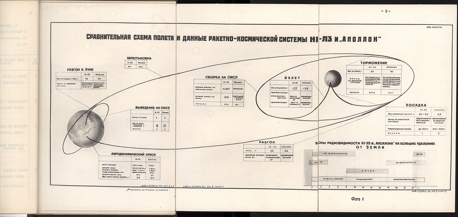
First I worked on the Russian version, on the basis that I would then have something I could translate. The small text was challenging, and beyond the reach of OCR, but the good people of the NK forums were exceptionally helpful.
This is what I started with:
Evolution of the design.
The amount of text soon convinced me that I would need to make 2 major changes.
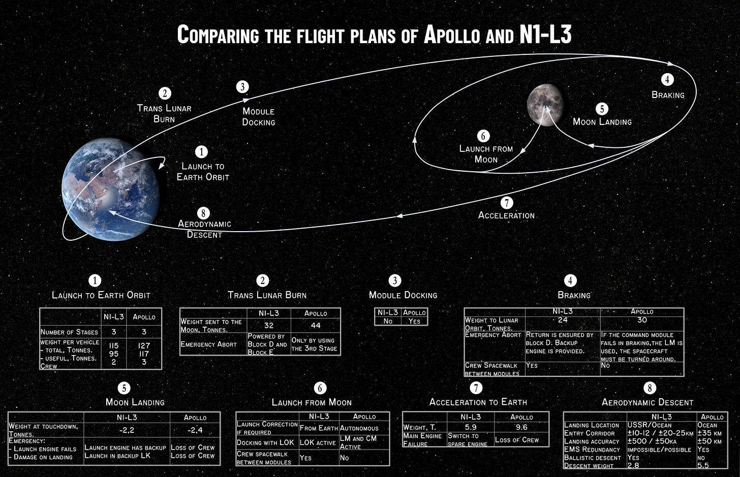
Move the information away from the event, and use a key.
Drop the table on the bottom right that compares ground station coverage.
What I did NOT change was the information as presented - my objective is to show the original in English, and make it look nicer. I’m using Affinity Photo / Designer for the project, with bitmaps rendered in Lightwave 3d.
The Russian Version:
Here’s a slightly reduce scale JPG image of the Russian version.
The English Version:
This proved a lot more challenging than I was expecting, computer translation REALLY struggled with many of the terms. I would have had no idea at all if I wasn’t familiar with Apollo. This time some Facebook friends who are bilingual techies came to the rescue, and helped me make sense of it, which took several passes!
Observations on the Poster
The information is generally pretty solid, I’d say. The most obvious point of objection is the way the N1 and Saturn V are directly compared as 3 stage rockets. Well, they are both 3 stage rockets, but when the N1 3rd stage is finished everything is in low Earth orbit. And when the Saturn V 3rd stage is finished, everything is on its way to the Moon.
Much is made of the LK Ascent stage having a backup engine, which I think is fair enough. Its a very clever piece of engineering. Combine this with the spare LK Lander, and it’s a resilient system.
Get your copy now!
I’m making both versions freely available, and not claiming copyright, you can do what you want with my files. I’ve made versions available in JPG, PSD and PDF format, the last two have layers so it’s easy to edit the text and move elements around.
https://starbase1.gumroad.com/l/N1-3L
It’s on my Gumroad site, as a pay-what-you like product, including $0. Of course, if you want to support my work, paying more than the minimum is very much appreciated.
This Edition’s Cool Link:
Sputnik Archives: https://sputnik.rusarchives.ru/
There’s a strong focus on the earliest days of the Soviet Space Program. They use the same catalogue system as RGANTD, but this site plays nicely with computer translation, and doesn’t mess around with image blocking.
No cool image in this edition, as you’ve already had 2 cool posters!


I had the large NASA GOSS Apollo mission profile poster hanging by my bed when I was a kid. I spent countless hours standing on the bed studying every minute detail.
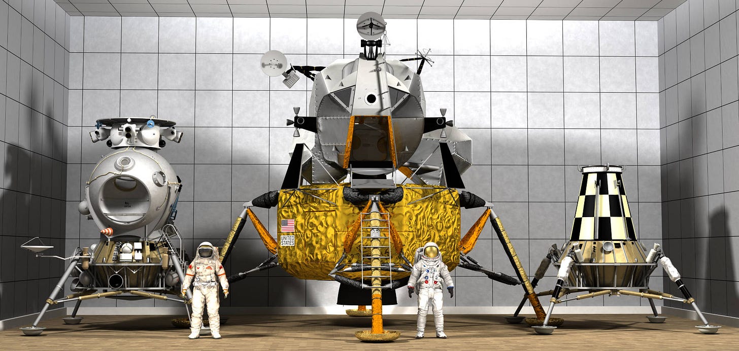
Beautiful rendering of the lunar landers. May I ask, is that your LEM model or did you source it elsewhere?
I was hoping to also see a full version of the CSM/Soyuz comparison teaser image in the main article.
I'd love to get more details, so I could match the level of information on the old Apollo posters.
Not my LEM model, I'm not sure which one I used, I have a few... It might be one that Shrox (Of IAAA fame!) let me use.
As for the teaser image... I wanted something colour in the right proportions, and that sprung to mind. The article was already close to the recommended maximum length.
However, I have lots of numbers for the LOK and LK, and if I can get the equivalent Apollo data, (which should be straightforward), a side by side comparison would indeed be good!
I'm also working on a picture with every Soviet Moon Lander design I can find, to scale by all the others. I'm up to about 16 I think...